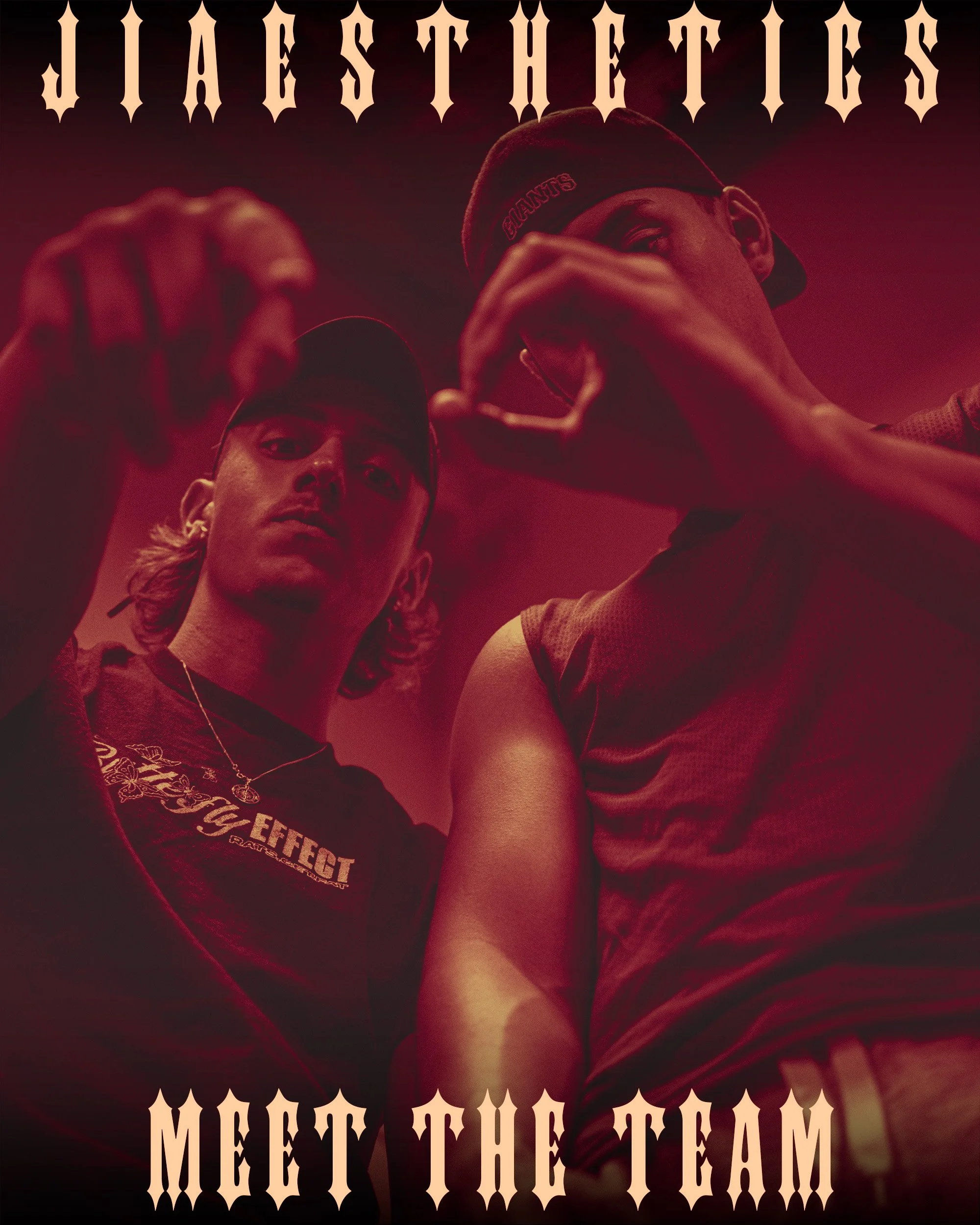
JIAESTHETICS
JIAESTHETICS is an online fitness coaching brand that aims to break the stigma of the fitness industry. JIAESTHETICS stand out by focusing on the experience they provide. They treat every client’s journey as their own and regularlary check up on them.

JIAESTHETICS (JI) is a start-up brand that approached me looking for a logo and basic branding to establish its style. The first step of establishing this company was creating a logo. Afterward, I would work on the colours and fonts of the brand. Ironwood was the desired font of the client and matched the brand they wanted to create well.
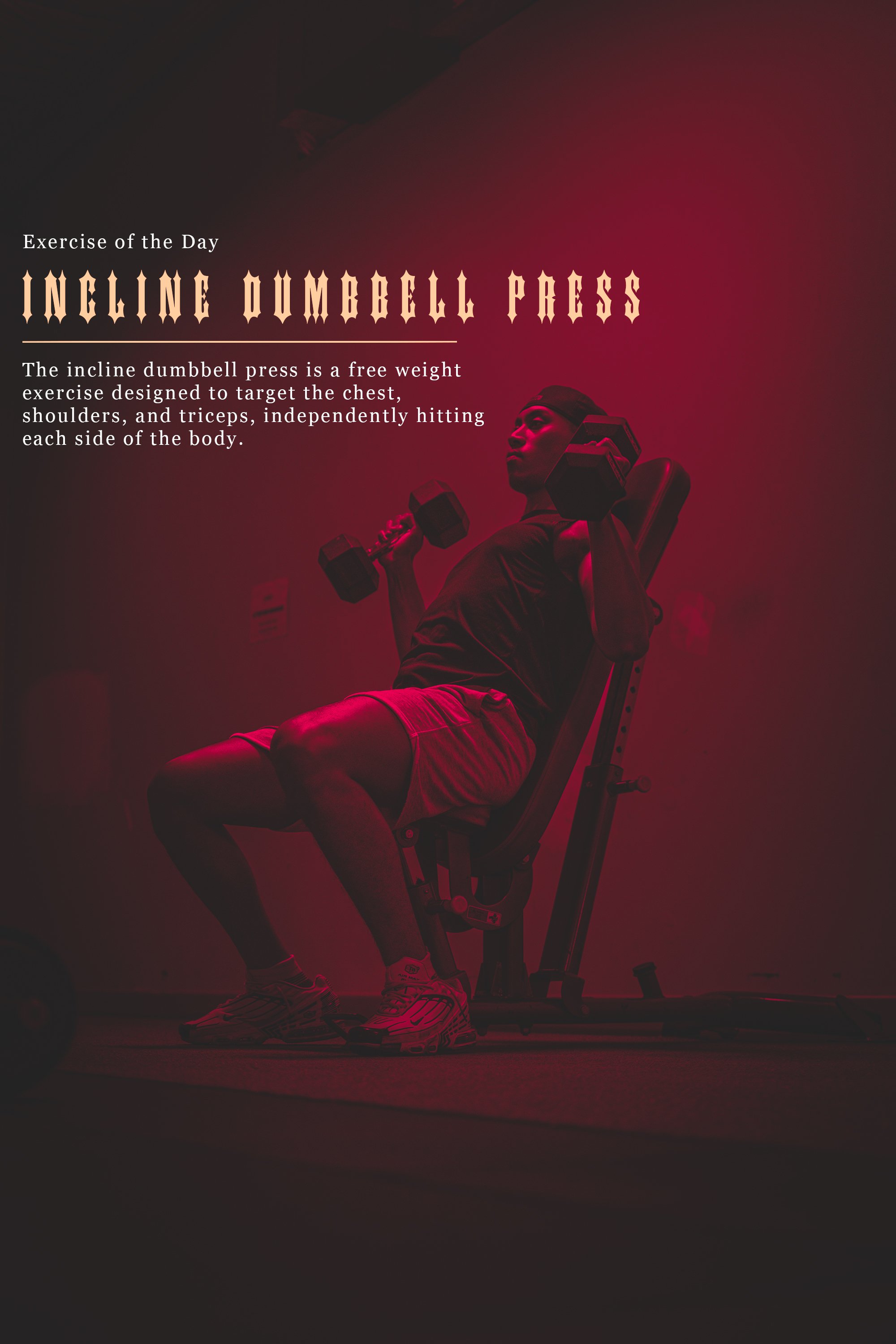
The colour pallet chosen features a simple maroon pallet that makes up 90% of the brand’s backsplash that can work independently. The cream works as a contrast that stands out against all three of the other colours.
The JI team liked the colour and font but was unsure how they wanted to present their brand. JI wanted to stand out from competitors by creating unique advertisements and posts against generic gym marketing. However, the two members were torn between “Groovy” and “Street/grime”. After exploration of both themes, we arranged a meeting to discuss the future of the branding. I emphasised that the logotype did not align with a “Groovy” style, and recommended the grime style if they were to move forward with their logo. They agreed and I began producing Social Media posts using the style we established with images I took during a shoot.